Zend Framework 1.5 Released
March 18th, 2008
Posted by Fred Wu
And alongside with the new release, they have revamped their website too.
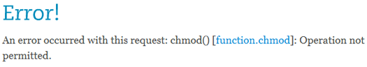
The website looks better than before, but… oops… that happened when I tried to use the search box:
They have now included a quick start guide which is awesome. For some reason though, I still can’t find a change log on their website.
In my opinion the new website is still horrible to use, the home page is more confusing than ever (huh? why is the roadmap under ‘Give Back’?). I guess the designer didn’t read Steve Krug‘s Don’t Make Me Think. ;)
It feels very ‘Microsoft’y… fingers crossed…

I believe Matthew has fixed the search error you encountered already. The reasoning behind putting roadmap under ‘give back’ was that contributors would be interested in the direction we’re heading in as people who are currently involved in the future of ZF. But I see your point. If you post your feedback to the contact us form, we can take this in to consideration as we gradually improve the site over the next few weeks.
We also didn’t change the structure/navigation of the site much, and some of the content is still out-of-date or ineffective or both. We’ll be working on this over the next few weeks as well. The simple fact is that we only had a certain amount of time to devote to the site before the launch, so there were things we wanted to do that we decided could wait.
I’m not sure what you mean by microsofty. :) We’re not trying to replicate or avoid anyone’s design (although we certainly took what we thought were good ideas from other sites out there). We’re really only interested in the site serving our three main viewers: decision makers, developers, and contributors (obviously 1, 2, or all of those roles can be held be held by same person). If you have more specific feedback on this point, I’ll see how we might address it.
Thanks for checking out the site, and I hope you find some of the improvements- like the one-stop search- useful in the future!
,Wil
Hi Wil,
Thanks for commenting on my blog, I really appreciate the fact that you care about users. :)
As of the time I’m writing this comment, the search function still isn’t working. I am sure it will be looked after.
By ‘Microsoft’y, what I really meant was the website presentation isn’t as clear as it could have been (which is a common problem found in Microsoft products). It requires too much thinking in order to sort out the varies links and sections of the website.
For the home page. Besides the huge download button (which is very good by the way), there are three sections, each contain two news feeds and four links. This is a total of 18 links in the same importance level. In my opinion this is way too busy. It will be a good idea to make more important links (such as the quick start guide) stand out from the rest. The number of links are still the same but the user is able to immediately work out which links are the most likely ones that they will click on.
Also, I do hope the change log to be back soon, it really helps developers keep track of what’s happening in an easy and straightforward way. :)
It’s good to know that things are being looked after. Keep up the good work!
Cheers,
Fred
Thank *you* for the feedback! We’ll make sure the search is fixed ASAP. I’ll ask Matthew the status today.
I see your other points, but there is some twisted logic behind our madness. ;) We created the 3 boxes to address the 3 roles that the vast majority of the website users fall into: decision makers, developers, and contributors. I’m wondering if your experience with the website may be mostly from the perspective of one of these roles. In that case, there may be content on the front page that you’re not interested in. Let me know if you think that’s the case, or you think there’s another problem.
We do plan to have the sections open so that the whole front page addresses one role. In that scenario, the quickstart would be featured prominently for the developer role. Check back with us in a few weeks and see if our solution is effective. Don’t forget to email me or submit a contact us form to make sure we get your feedback!
,Wil