Telstra Web Site – Log In – Bad Useability
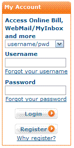
It’s funny how a company the size of Telstra can have such bad usability on such a basic part of their web site. Take for example, where users can log in to pay their bills or check their account:

Tabbing through the form takes you from Username to Forgot your username, instead of going from Username to Password. When choosing your tab sequence, always go for the order that the majority of users will be using the majority of the time.
To make matters worse on the Telstra login, when you hit enter after typing your Username and Password, it doesn’t submit the form. I can’t tell you the number of times I’ve waited a few seconds before realising.
Not as serious, but why have the Register button the same size and style as the Login button…?
